Connected Card Studio
Reinventing how Visa presents connected experiences to their clients through an immersive, storytelling platform
Problem
How might we present an end-to-end user journey to our Visa Debit Processing Services issuer clients that would enable them to experience this through a cardholder's perspective?
Outcome
An innovative, multi-media studio that not only visualized our digital strategy, showcased our human-centered design process, and shared our future vision, but also provided a venue for discussion and feedback with our Issuer clients.
The process
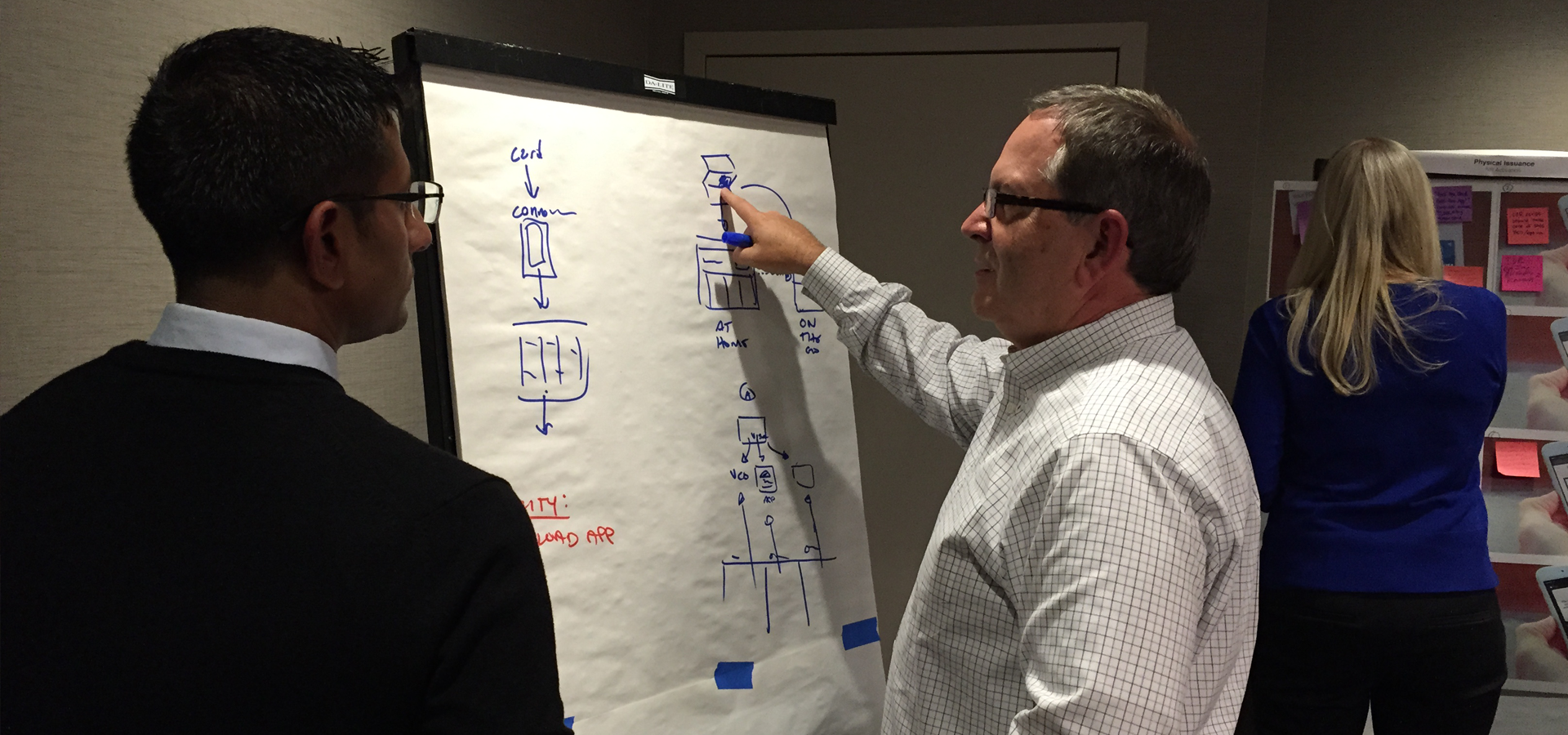
Crafting a shared future connected vision
We partnered with the Visa Debit Processing Services team to create a new future vision on how Visa can partner with banks to reinvent the cardholder's end-to-end experience. From card activation to fraud resolution to new card issuance, we reimagined these "hero moments", which cardholders associate with their bank and Visa to match up with the technology and user experience expected today.
Storytelling from the ground up. Literally.
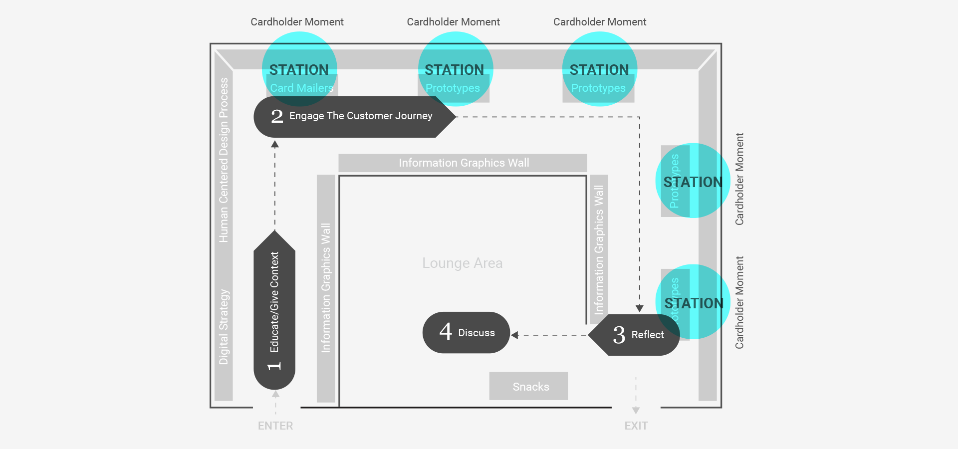
We felt the best venue to communicate this future vision to our issuers was through an immersive, walk through, physical environment. Our first step was taking the future vision we created and infusing that narrative into the floor plan of the space. The intention behind this was to enable the issuers who walked through the space to view our concepts from the eyes of the cardholder. We targeted the Visa DPS Users Conference in Denver, CO as the debut for this new storytelling platform.
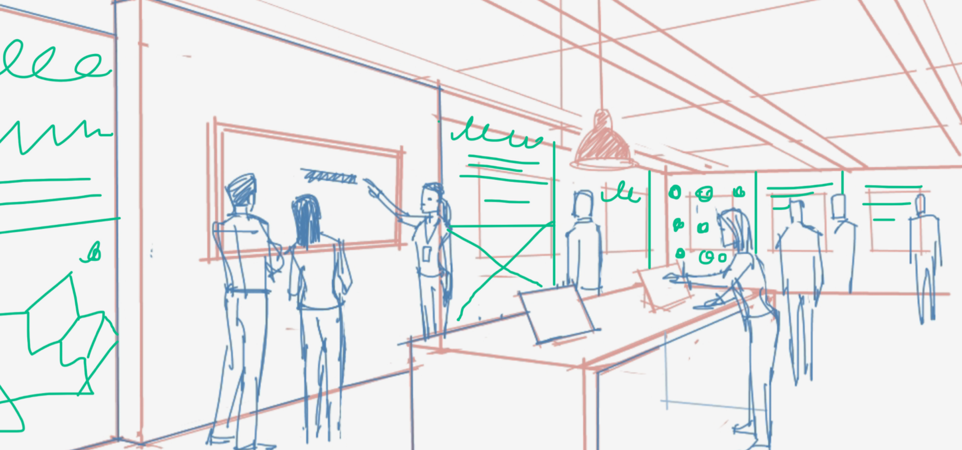
Designing for 1 foot, 5 foot, and 10 foot experience
We expected between 200 to 300 people to come to the conference. Because of this, we felt it necessary to accommodate for varying levels of interaction with the space. There would be the 10 foot experience for folks who would walk through, pause for a minute, and then continue on without engaging anyone. The 5 foot view for those who wanted to engage in conversation and read what was on the walls in more detail. The 1 foot view was for those who wanted to pick up the mobile devices and interact with the prototypes on them.
Creating a reusable physical storytelling space
Outside of the challenge of designing the space was our ability to create one, which could be reused at different venues outside of the Sheraton in Denver, CO for the Users Conference. We worked with a vendor to create walls made from fabric, which they would store for us and then ended up reusing it two more times.
Final delivery
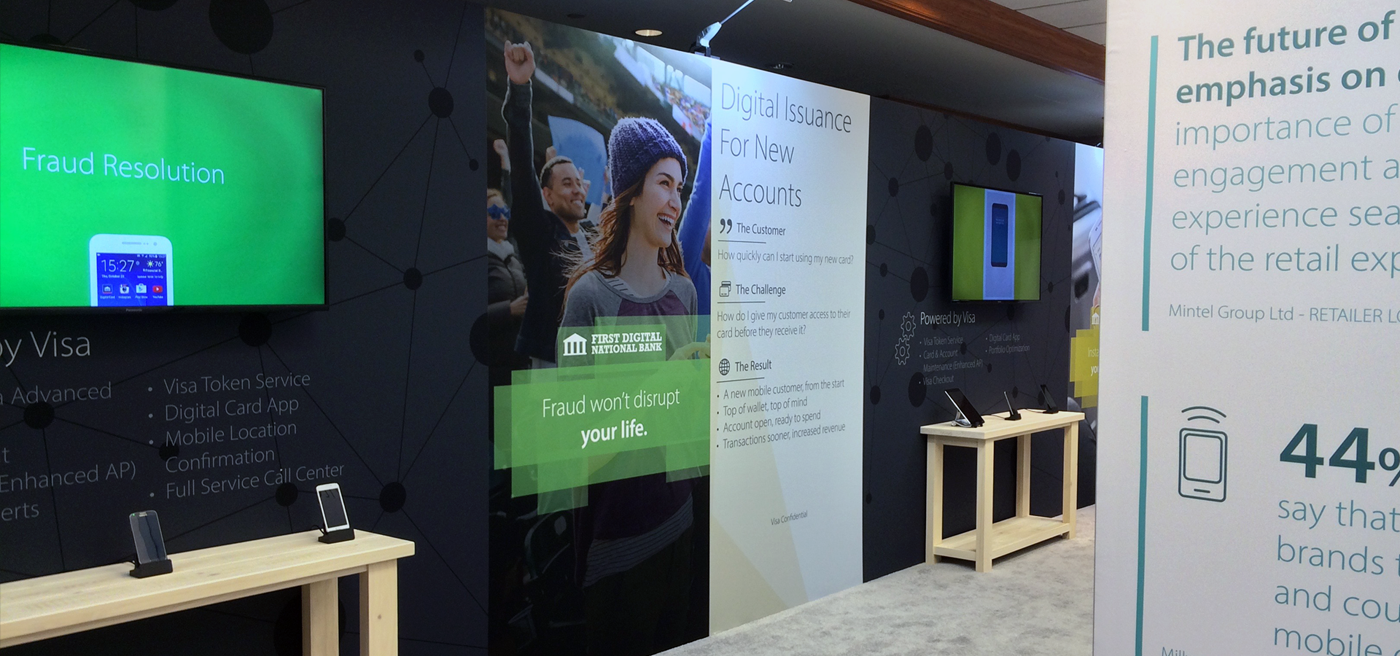
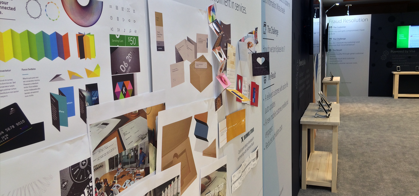
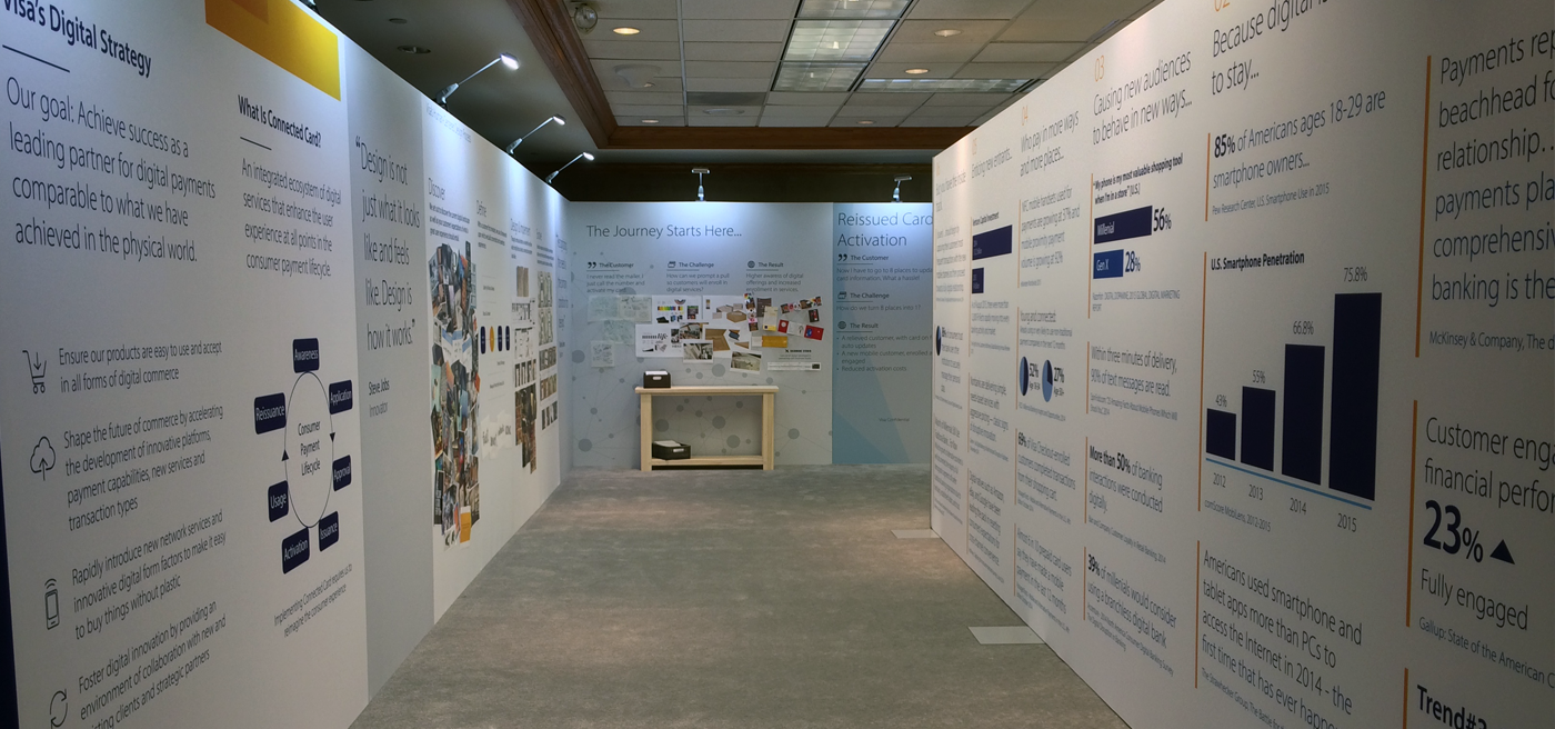
Vision on the left, data on the right, and the future ahead
The space was designed to contain the future experience on the left wall. Directly across on the right wall was the data visualized to juxtapose facts and numbers to support the vision we were proposing on the left. This relationship between both sides of the wall as it pertains to the user's position within the overall room carried through from the very beginning as they walk in till the moment they are about to exit.
Frame the problem, show the moment reimagined, and provide a roadmap to get there together
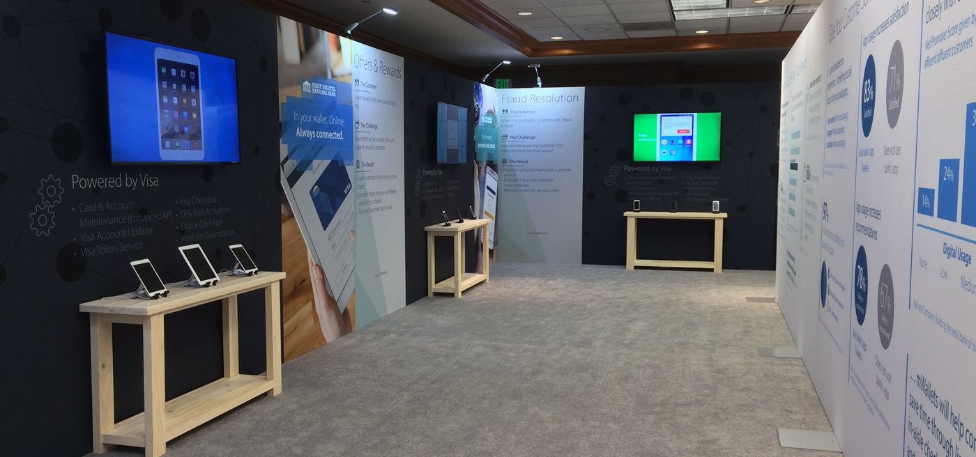
Each reimagined cardholder moment was encompassed within a prototype station. Each station was organized into three panels. The left panel framed the problem we wanted to solve and challenged the user to think differently with a provocational question. The center panel had a table in front of it, which contained the devices with the future vision prototype on theme. On the wall itself, the television played a run through of the prototype with the messaging about value props. Below the television was a roadmap of products and services, which could be realized between one and three years out from that day. The right panel featured an example of how an issuer could market this new experience to their cardholders.
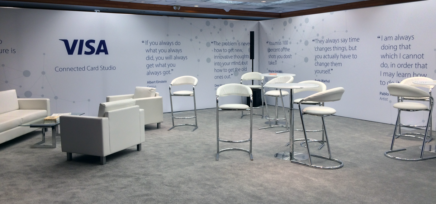
A place where issuers could reflect on what they'd seen and discuss how they partner with Visa to make this a reality
We needed a space where someone could sit down and talk with folks from Visa without taking up space in the passageway where other people were walking to view the overall space. Coincidentally, there were people who came back just to sit in the lounge so they could check email and take a break from the hustle and bustle of the conference.
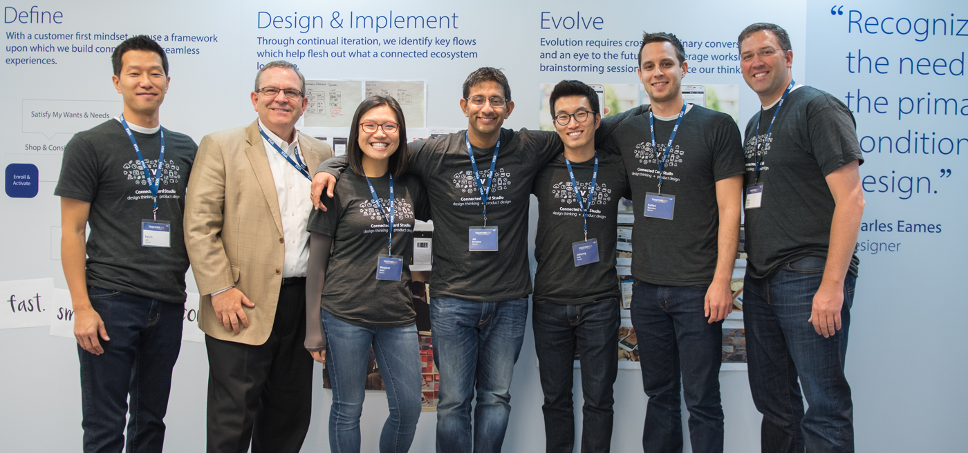
Team work makes the dream work
A critical part of the success was the Connected Card Studio team. This sort of experience is never accomplished by a single person. The folks who worked on this space were also charged with communicating the value of the vision to those conference attendees who visited the studio.